Designing a mobile fridge app to reduce food waste
September 2023 - December 2023 | Miro and Figma
Overview
-
This project was completed for one of my required User Experience courses at the School of Information. We were tasked with selecting one or more of the United Nation’s Sustainable Development Goals, and create a design to support it. My group selected number three, good health and wellbeing, and 13, climate action. We decided to design a mobile application to support the reduction of food waste generated in Ann Arbor, MI households. While conducting our first user interviews, we uncovered frustrations towards managing one’s fridge and pantry inventory, inspiring us to pursue a fridge management app design.
-
My team was composed of four other classmates, and we each assumed the role of UX designer and researcher. I also took the lead as project manager, supporting the organization of my team’s tasks and deliverables.
The Problem
How might we reduce food waste in Ann Arbor households by addressing poor food inventory management and the misinformation surrounding expiration labels and food preservation, while encouraging interaction with members of the community who lack food security?
Research
Competitive Analysis
Our research began with a competitive analysis of the existing apps and services for the reduction of food waste and/or the management of food. We looked at five competitors including HelloFresh, No Waste, Feeding America, MyFitnessPal, and MealConnect by Feeding America. Within each of these competitors, my team and I analyzed the extent of their community involvement, their marketed method of achieving goals (such as reducing food waste), their environmental considerations, user incentives, and the affordances of each application.
The most distinct pattern we noticed across each of the platforms was the function of personalization. For HelloFresh, users had full reign of the meals they could select for their weekly deliveries, on No Waste, users can create inventories for their freezer, fridge, and pantry, and share these lists with other members of their household. MyFitnessPal excelled in the personalization feature, allowing users to create their own diet plans and offering them individualized health metric information and insights. In addition to personalization, we noticed that many of the competitors had online community features, such as MyFitnessPal’s feature where users can share their fitness progress with friends and compare their health trends.
The Analysis
Features to Include
Food inventory trackers for fridges, freezers, and pantries.
Community engagement, either internally or externally.
Support for budget tracking.
Combination of notifications and a simple interface to encourage users to return to the app.
Personalization.
User Interviews
In order to create a better understanding of the food management and usage patterns of our user base, my team and I conducted two user interviews each, resulting in 10 user interviews. Each of us generated 10 questions to ask participants with the goal of identifying our participants’ food behaviors, understanding of food labels, and concern with food waste production.
The prominent findings from my interviews were that people opted for purchasing the same items each time they go grocery shopping, often purchase produce they end up discarding, have a generally good understanding of the different food labels, and individuals may not have a concern about the food waste they are generating.
My group and I discussed each of our individuals findings, then pulled interview quotes and sentiments and organized them onto a Miro board. With all of our insights in one place, we organized the findings into main themes.
Main Themes
Food label adherance and understanding is strong, but knowledge of food waste reduction techniques is limited.
Grocery shopping is conducted 1-2 times a week and often involves the repurchasing of the same items.
Produce frequently goes bad in fridge drawers because it’s out of sight, out of mind.
Food is consumed according to dietary preferences and availability of other foods.
There is a significant amount of guilt associated with constantly throwing away spoiled produce.
There is demonstrated interest in discovering new recipes, but finding suitable and simple ones is difficult, especially for families with varied dietary restrictions.
User Personas
After processing our user interview findings, my team and I identified two potential users of our design: Wade Warren, the late-night cook, and Cameron (Cam) Feng, the stay-at-home parent.
Feature Ideation
Sketching
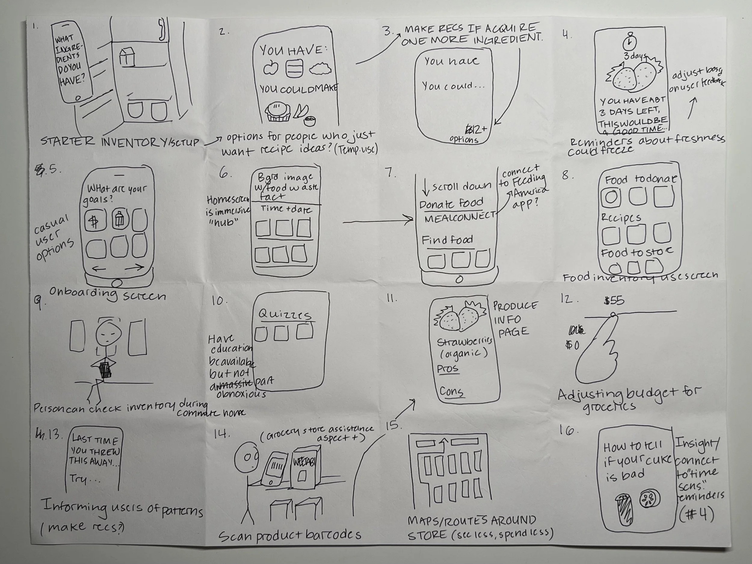
While brainstorming the ways that a mobile app could help users to manage their grocery usage, our team utilized the quantity not quality approach. To support this, our professor, Dr. Oliver Haimson, instructed each of us to create 32 sketches to begin ideating what our user personas might be able to accomplish with our design. My sketches are below.
Group Brainstorming Session
In addition to the sketches my team and I created, we had a whiteboard brainstorming session, where we used our interview findings to begin outlining the functions of our application. From this brainstorming, we identified several key features for our app:
Onboarding quiz to figure out what user’s goals are to customize their app experience.
Mobile inventory for users to keep track of what food they have at home.
User profiles where users can add their favorite foods and recipes and keep track of their food inventories.
Ability to allow other users to manage a household’s fridge and pantry.
Add items to inventory via a barcode scanner or manually.
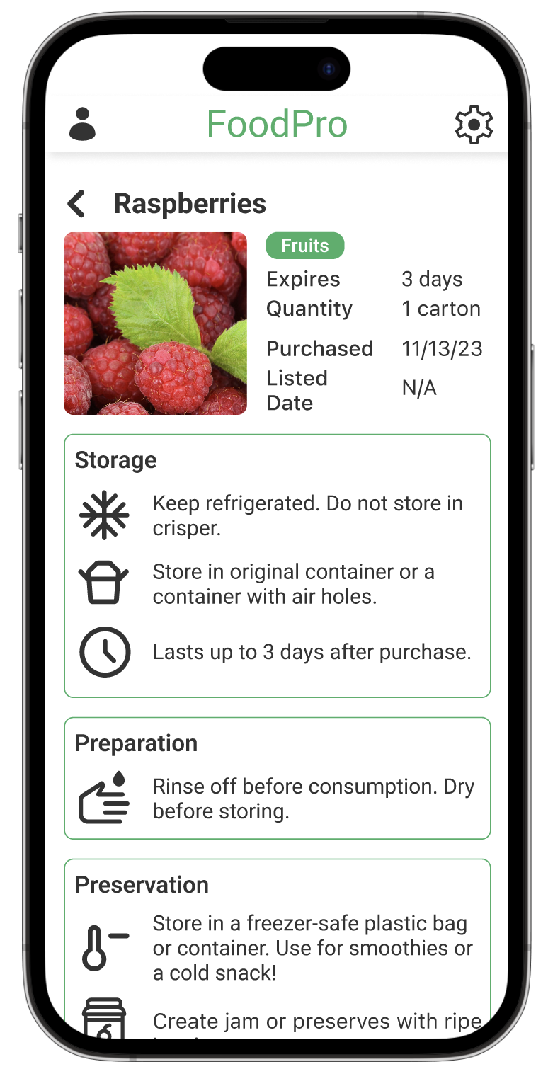
Item detail pages with information on signs of spoilage, long-term storage methods, and recipes.
Grocery shopping lists.
Integration of bank apps to allow users to easily track their budgeting.
Prioritization of quick and easy recipes.
Users will receive reminders for food that is going to expire soon.
Users can create and track grocery budgets.
Support for sharing inventories with households and families.
Embedded calendar feature to give daily recipes based on what the user has in their inventory.
While not all of these features were incorporated into our final design, they gave us a clarified understanding of the main functionality of our app and allowed us to connect the frustrations of our interview participants to design solutions.
User Scenarios
Cam’s unexpected visit from in-laws
Cameron is driving to pick up her children from school. While driving, she receives a call from her husband. He unexpectedly tells her that his parents are coming to town for dinner. Cameron is overwhelmed and feels annoyed at the surprise, but her husband emphasizes that she doesn’t need to cook a big meal or go all out. She now wants to make something nicer than what she was planning, which was grilled cheese and tomato soup. While in the pickup line at her daughter’s preschool, she goes on the ShopRite app and orders ingredients to pick up in store to make chicken broccoli stir fry. She picks the ingredients up and dinner goes off without a hitch. However, afterwards Cameron realizes that in her frazzled state she ordered way too much food and even a few ingredients she didn’t need at all. She is annoyed that she now has to figure out what to do with the extra food.
Wade’s late-night dinner
Wade has been preparing for a presentation for work all week. One night in his apartment, he looks up from his laptop to find that it’s past midnight and he hasn’t eaten since that morning. Wade is hungry and doesn’t want to pay a high delivery fee to have a meal delivered, so he decides to cook dinner for himself. Opening his fridge, he is taken aback when he realizes that in the midst of preparing for his presentation, he also has not gone grocery shopping recently. His fridge is nearly empty, and he sighs in frustration over the thought of having to cook a bland meal. Suddenly, Wade remembers the food waste app his friend made him download a couple weeks ago. He pulls it up and is relieved to find that a few of his groceries are already scanned in and the app prompts him to log the rest of his inventory. Once he uploads some other ingredients, the app presents him with a few recipes he could make with what he has. He is surprised to find one for bibimbap, one of his favorite foods, and chooses that recipe. Although the original recipe suggests meat, Wade alters the recipe to include just veggies and even gets his protein fill by adding an extra egg. Overall, Wade is satisfied that he can still have a delicious meal to fulfill his appetite without having to spend money or sacrifice taste.
Wade’s Storyboard
User Flow Diagram
Once my team and I had an idea of the functionalities of our app, we organized the features into a user flow diagram using Miro.
Low-Fidelity Prototype
Usability Testing
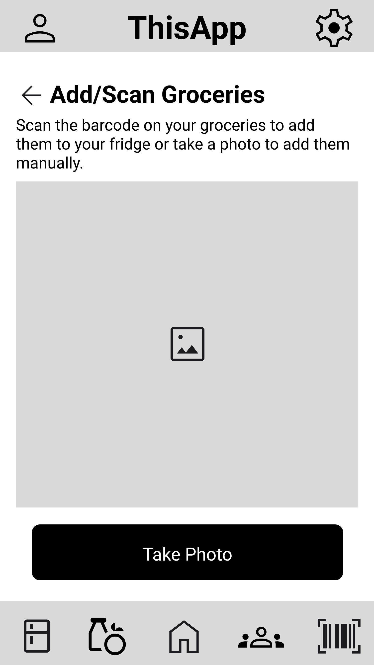
Once we prototyped our low-fidelity wireframes, we completed several usability defect logs to identify the main problems with our design. The first issue was the lack of labels for the bottom nav bar. Our navigation included several uncommon icons, which left participants confused on their purpose. We also discovered that we forgot to include a back button for several subpages, leading participants to a dead end in the prototype. We also realized that participants were confused by the two different barcode scanners, one which was meant to act as a price-checking tool and the other to add a new item to their inventory. To fix these usability errors, we added labels to the navigation bar, modified the price-check feature’s purpose to be more distinguishable, and incorporated back buttons as needed.
Mid-Fidelity Prototype
Usability Testing
For our second round of usability inspection, we asked participants to complete five tasks:
Find a recipe based on the items in your fridge.
Mark off almond milk from your apartment grocery list.
Find out when your raspberries in your apartment fridge are going to expire.
Find the instructions for a recipe.
Add an item to your fridge.
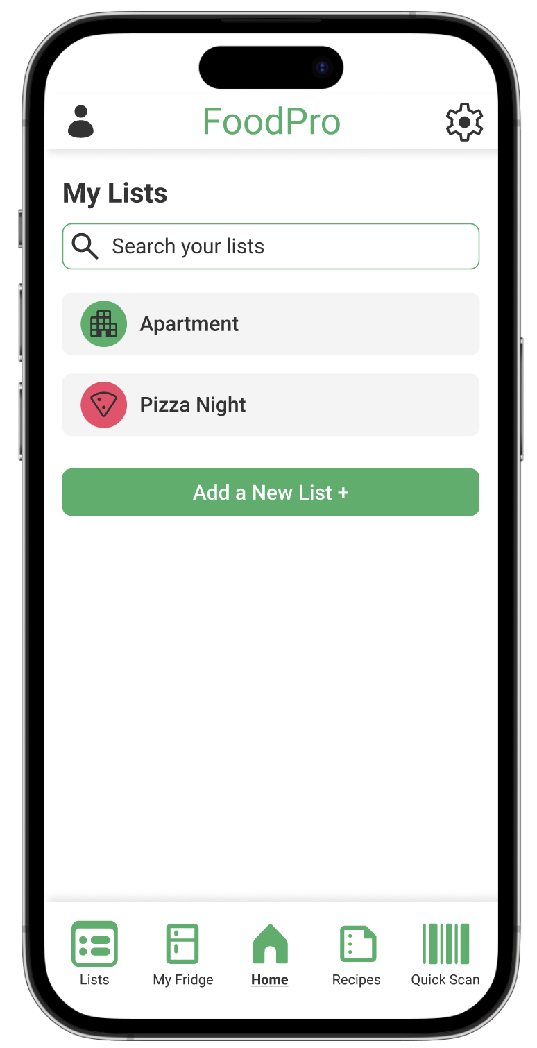
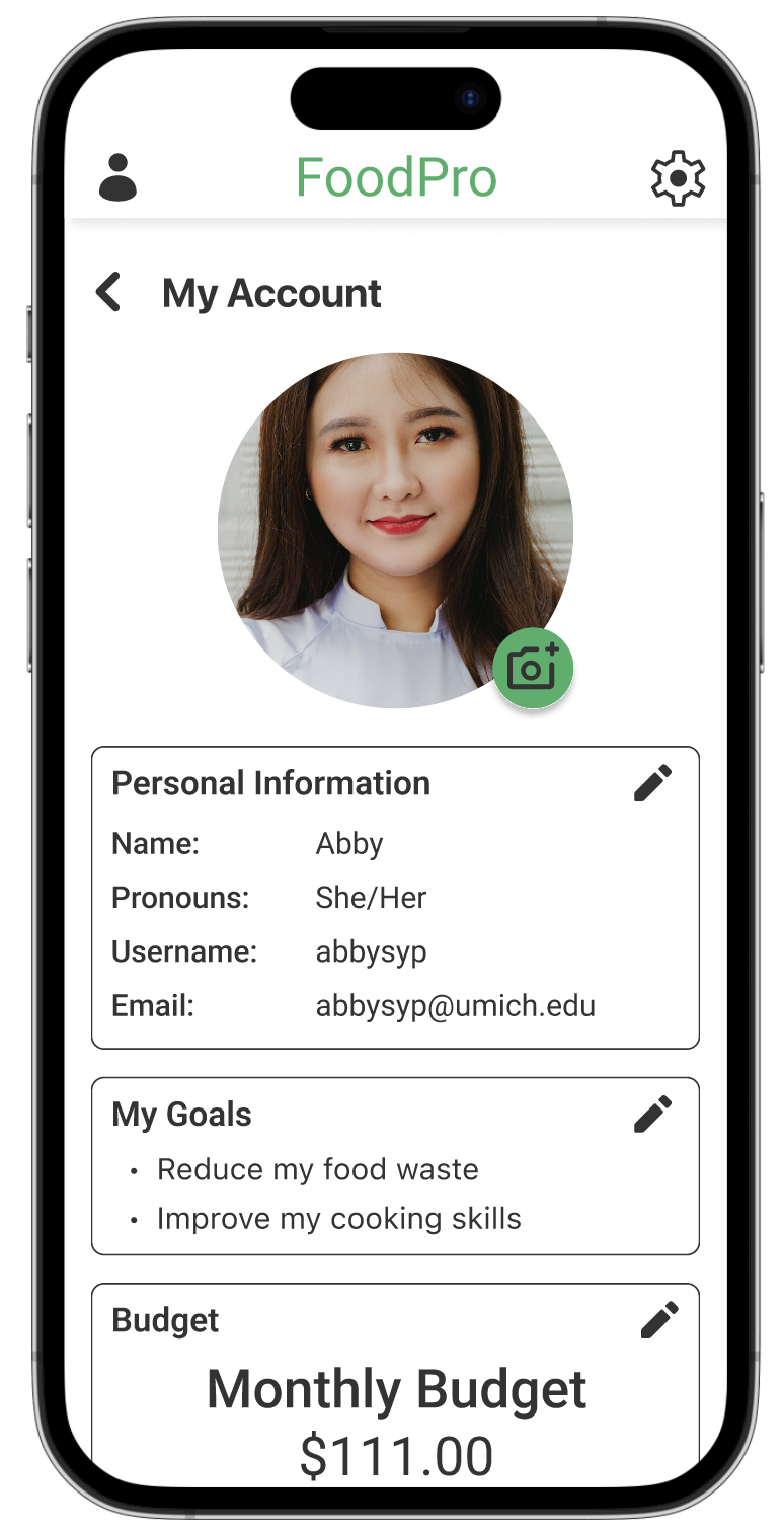
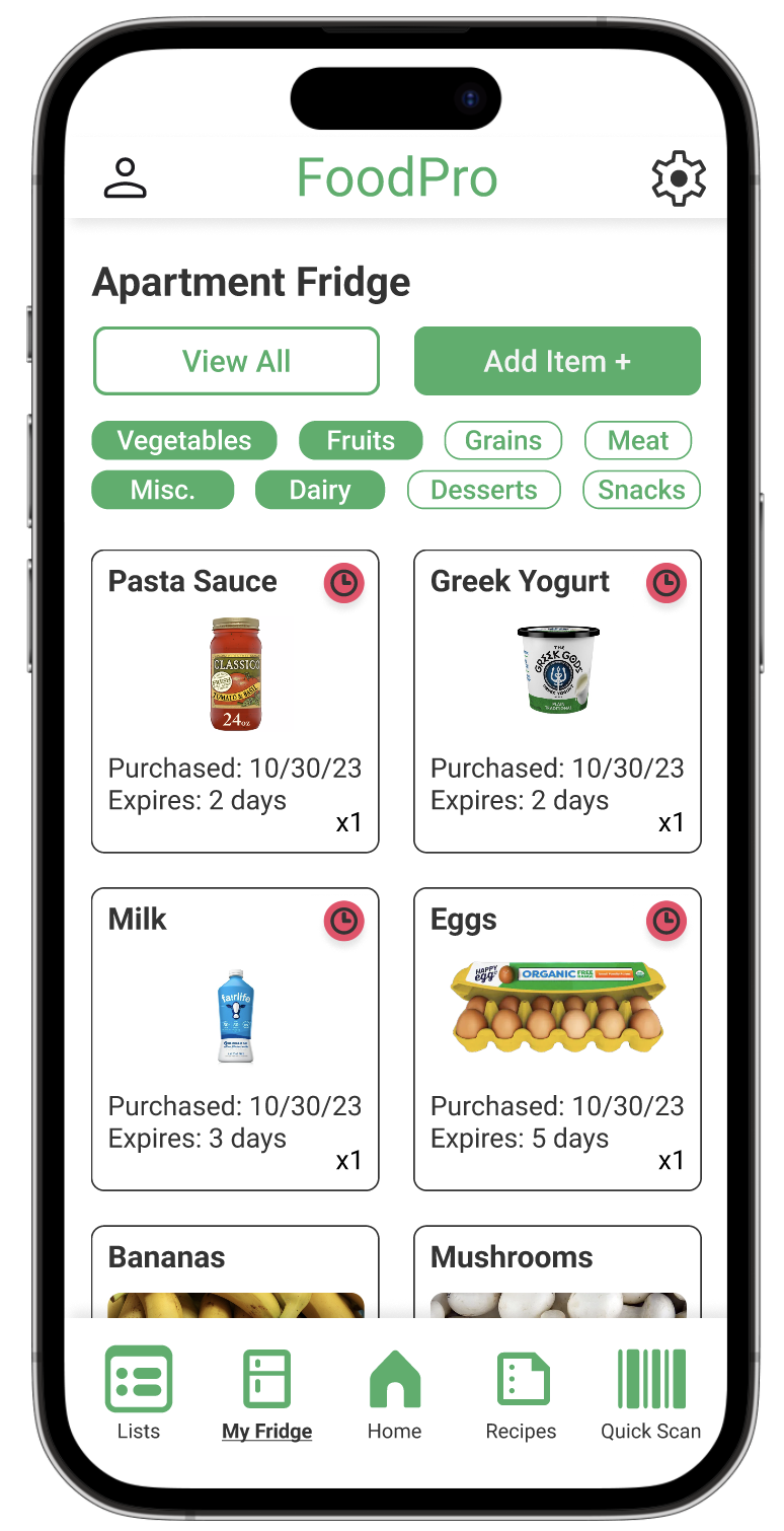
The most glaring issue we uncovered during these usability tests was the confusion towards having multiple fridges for different households. Participants were confused by the difference between “My Fridge” and “Apartment.” We had originally designed our application in consideration of students who spend time between their family home and their student housing, but realized that allowing users to track just one household’s inventory simplified the user’s experience. Further, our adjustments to the price-check vs. quick-add feature of our design did not resolve user confusion, motivating us to remove the price-check feature entirely. One participant also suggested we allow users to scan receipts to quickly add items to their inventory, which we decided to incorporate. Finally, one of our participants pointed out that the button to add new items being at the end of the inventory’s list meant that a user would have to scroll to the bottom of the page to add new items, which would be tedious if they had dozens of items. Thus, we decided to make the “Add item” button much more prominent and located at the top of the page.
High-Fidelity Prototype
Final Takeaways
This project was done for the course SI 482, Interaction Design Studio, and was one of the first start-to-finish UX design and research group projects I got to complete. It was an invaluable experience, as a UX project is unlike any other group project, in the way that each phase of research and design must be conducted collaboratively and each member of the team has to be on the same page every step of the way. Without constant communication and peer-evaluation, key design requirements are overlooked, wireframes are incompatible, and great ideas are left unacknowledged. I also discovered that it is extremely helpful when someone takes on the role of project manager. Group projects are like a volleyball game—if no one yells “I got it!” as the volleyball passes over the net, the ball is hitting the floor and two teammates are colliding. During this project, I didn’t have to yell anything, but I noticed that as I divided our tasks and aligned them with deadlines, my group and I easily met each of our deadlines and created deliverables we were proud of.


