The Bar at 327
UX/UI, Figma, Ecommerce
Welcome to The Bar.
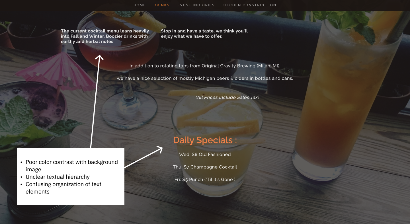
This project was undertaken as part of my SI 311 class, under the guidance of our instructor, Jim Rampton. We had the incredible opportunity to collaborate with Eric Farrell, the owner of The Bar at 327 Braun Court, in order to revamp their website. The original website suffered from issues related to accessibility, usability, and promotion. To tackle these challenges head-on, each of us was assigned the task of creating a comprehensive wireframe for the redesign. Our goal was not only to resolve the existing issues but also to enhance the website's marketing potential and expand its overall influence.
The Goal
Redesign the website of The Bar at 327 to promote online-ordering, event-hosting, and the “Third Space” nature of the bar itself.
The Inspiration
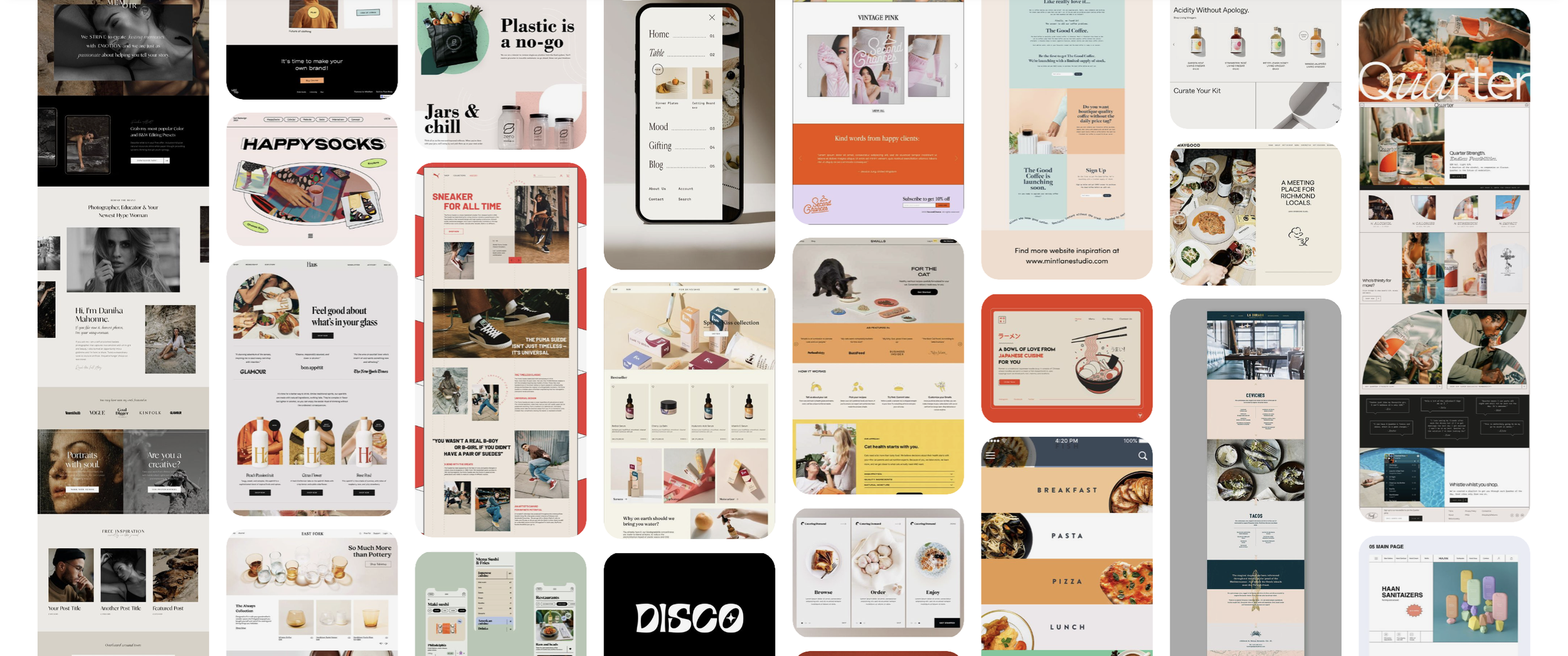
Before I create my first frame in Figma, I start my brainstorming on Pinterest. Below is an image of some of the inspiration for this particular project. You can view more with this link.
-
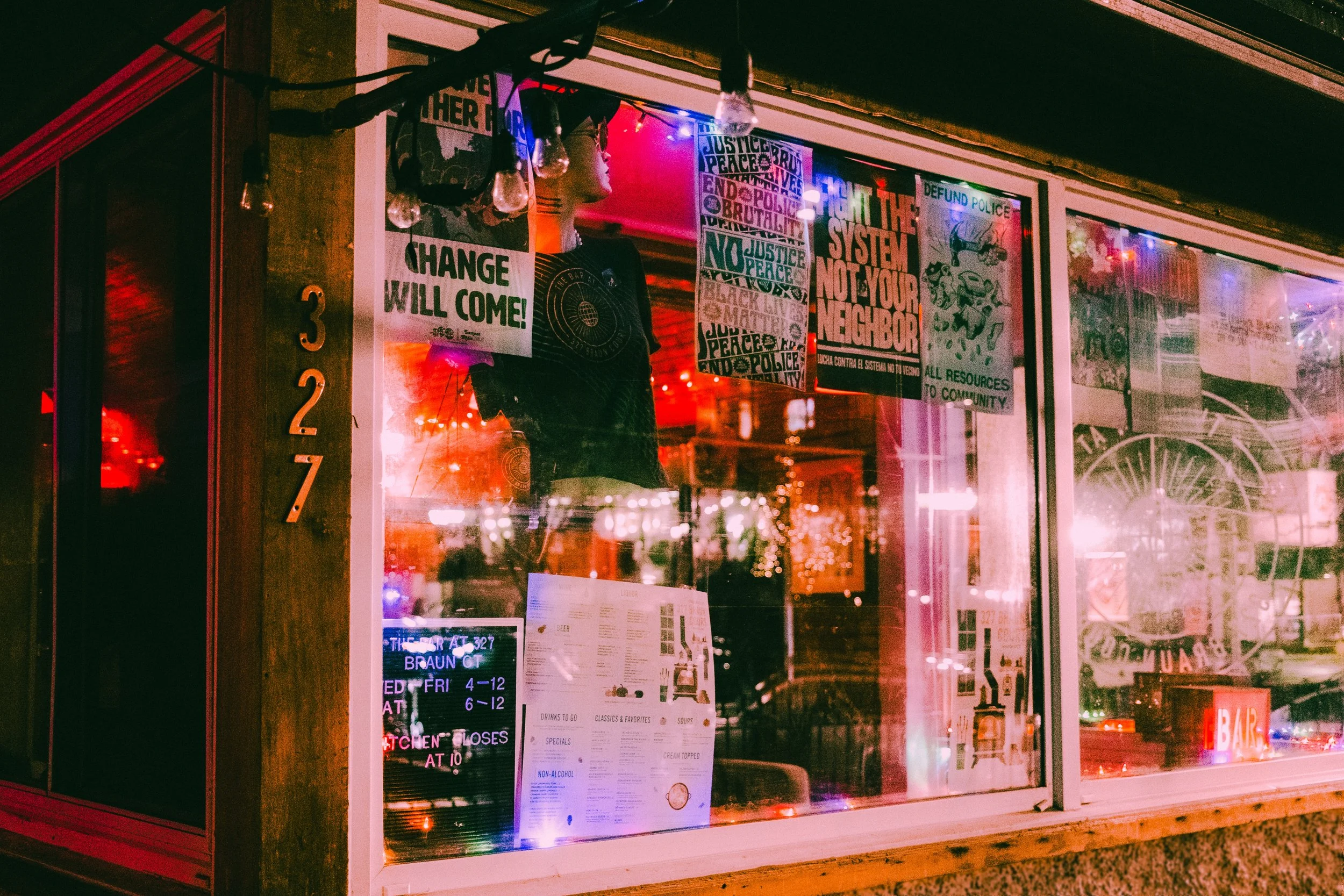
While touring the bar, I realized that this place not only means a lot to the community that supports it, but also to the bar owner. Beyond the money and time that the client has devoted to the bar, there is a unique and warm atmosphere that has been cultivated as well.
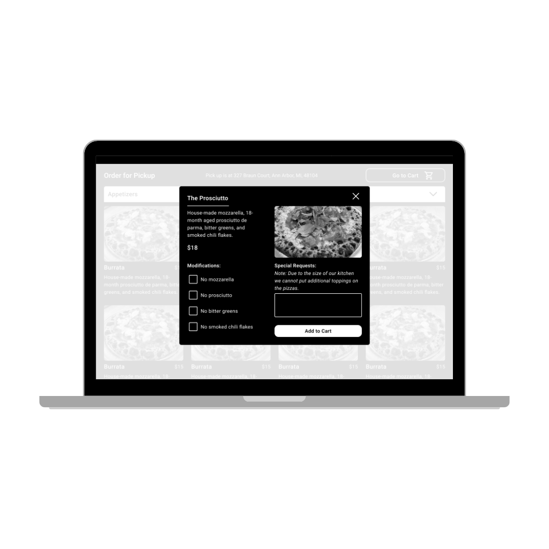
Additionally, my instructor wanted us to focus on the e-commerce aspect of the redesign. This meant designing the experience to be one that would support a user’s mental model of online ordering. In my redesign, this meant incorporating a product page for the food and drink items. Users typically use these pages to understand more about a product, and decide if they want to order it. To further support this model, I included an “Add To Cart” button on the detail page.
Some of the goals a user might have on a restaurant’s website include:
- Check hours, location, or contact
- Make an order for pickup
- Check the menu
- Explore the “vibe” of the restaurant/bar
-
As this was a course assignment, there were particular constraints the instructor had set. The constraints were supported by research from the Baymard Institute. Below are some of the particular principles we were expected to account for in our designs.
Homepage
- #240 - Avoid placing ads in prime content locations, avoid pop-up banners, and dialog overlays
- #985 - On the homepage, either only provide links to top-level scopes or include the full scope for the link text or button microcopy
Product Page
- #738 - Place full-width cross-sells as the last section on the product details page
- #1129 - Consider using a vertically collapsing section layout for the product page, unless selling only products that have limited product page content…
- #791 - Ensure the ‘Add to Cart’ button has unique styling that isn’t reused with other buttons and clearly distinguishes it as the page’s primary button
Shopping Cart
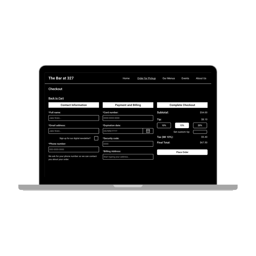
- #668 - Remove any unnecessary fields from the checkout flow
- #686 - Always label both optional and required fields on forms
- #683 - Avoid inline labels, ensure the error message state performs well
-
Beyond the overall appearance and navigation of the site, there were a few things in particular that the client wanted us to account for in our designs:
- Emphasize that The Bar is a “third space”, i.e., a place that is neither work nor school, but a separate, more relaxed location
- Organize and improve the efficiency of the event inquiry form
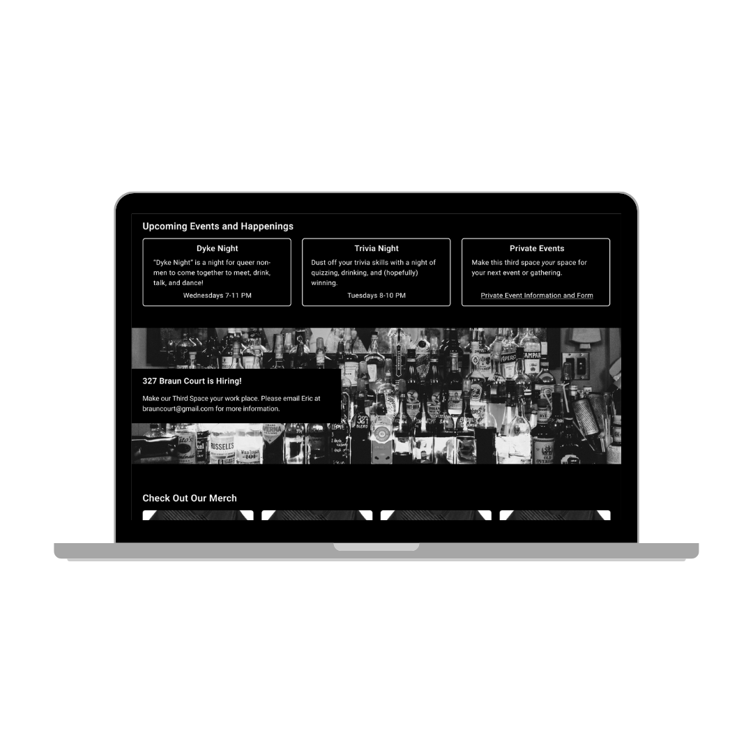
- Advertise that The Bar is hiring
- Promote the new addition of the pizza kitchen and other bar offerings
- Create and promote the functionality of ordering food and drink online for pickup
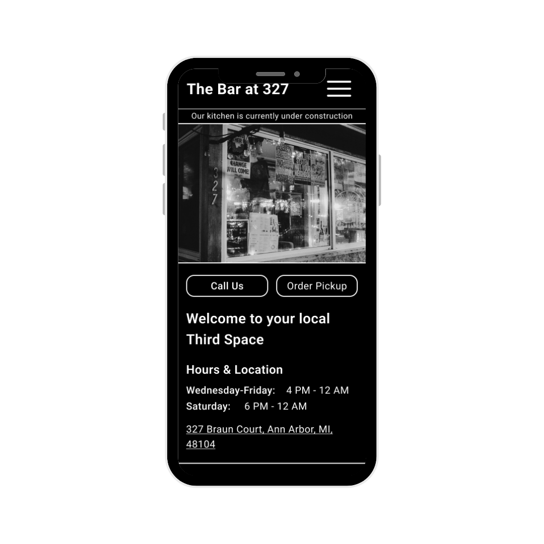
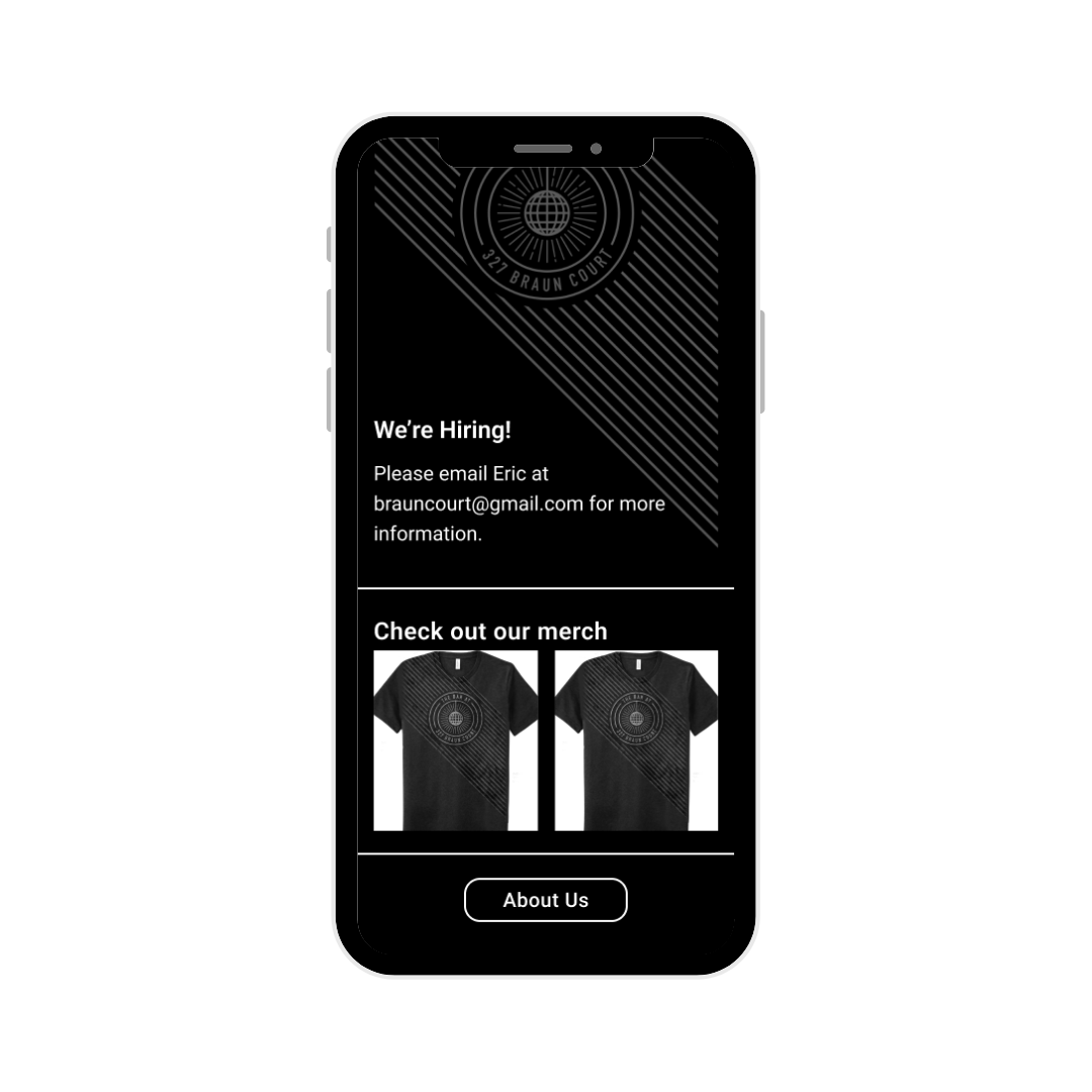
Mobile View
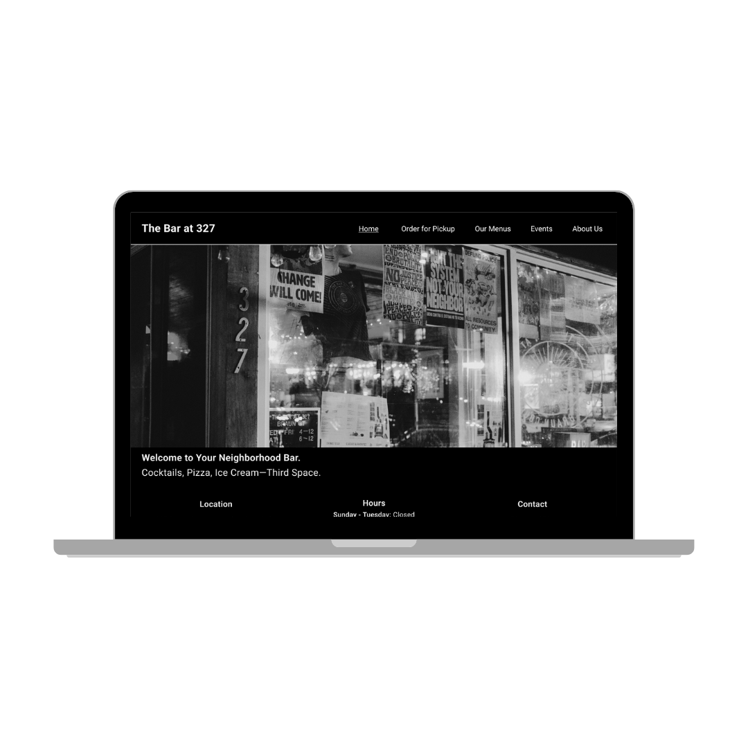
Desktop View
Final Thoughts
When I initially embarked on creating the wireframe, I lacked familiarity with effectively utilizing grids in Figma. However, as the project progressed, my proficiency in this area significantly improved. Moving forward, I aim to refine the consistency of the grids and columns incorporated in my wireframe.
Furthermore, while working on the wireframe, I encountered certain requests from Eric Farrell, the owner of the bar, that I was unable to integrate into my original design. For instance, Eric expressed a desire for the disco ball logo of The Bar to serve as a central element in the design. Initially, I was uncertain about how to incorporate this into the site. However, after witnessing my peers' presentations, I found inspiration and ideas for its implementation.
Overall, this project served as an invaluable learning experience for me. It marked my first opportunity to collaborate with a local business and create something tailored specifically for them. The process was incredibly rewarding, and I am grateful for Eric's trust in our class to develop designs that he intends to implement. I am confident that the lessons I learned from this project will greatly inform and enhance my future design endeavors.


