Responsive Personal Website
HTML, CSS, JavaScript, GitHub, UX/UI, Figma

Background
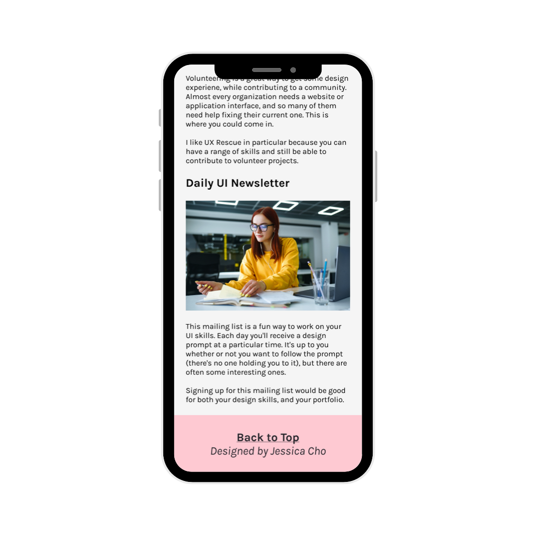
The following webpage was designed and developed by me for my Web Design, Development, and Accessibility course last semester. It was my first time building a website from scratch, and we got to choose to build any website we wanted. I chose to create a website to provide information about creating a UX design portfolio (meta, I know).
-
As this was for a course, we were provided constraints in the form of a rubric and a checklist. As the course was SI 339 Web Design, Development, and Accessibility, a significant component of the grade was the accessibility of the site. Here are some of the accessibility rules applied on this site and all of my subsequent designs:
Use descriptive alt-text for non-decorative images
Improve responsiveness using media queries for at least three breakpoints
Utilize a mobile-first design approach
Provide a “Skip to Content” link that is hidden by default
Use an accessible color contrast ratio
Utilize accessibility checkers such as Wave and Axe DevTools to ensure best practices
Don’t rely on color alone to provide users with feedback
-
Pages
Three pages (per breakpoint)
Common header, footer, navigation
Display what page you’re on in the navigation
Each page needs a Jump to Content option with the first tab on the page
One page with images should use a grid layout that changes with the three min-wdith screen sizes
One page with images should use flexbox that changes with the three min-width media queries
Responsive Design
Mobile-first design
Media queries for tablet and larger screen
Navigation must differ on all three views in a way that makes the site easier to use
Accessibility
Documentation must include validation demonstrations with Wave and aXe
“What we’re looking for”
Great responsive design
Visually appealing. Nothing is broken, sloppy, or awkward. Tell us how you chose/generated your color palette.
The content is complete—no broken links, content is cohesive.
Enhanced accessibility
E.g., alt-text
The Design Process
Wireframes
While there were some components I either wanted or had to include on this website, I knew I’d need to lay them all out to do so successfully. For this project, we were required to fulfill certain requirements in relation to using grid and flexbox in CSS. Thus, I decided the best way to organize my content and structure were to create a wireframe with a grid system. For this wireframe, I used a varying number of columns depending on the viewpoint. For my mobile, I used 4, and for tablet and desktop I used 8. I then used grids within those columns to organize my images with extra precision. I also created a style guide to reference throughout the design process.


Code
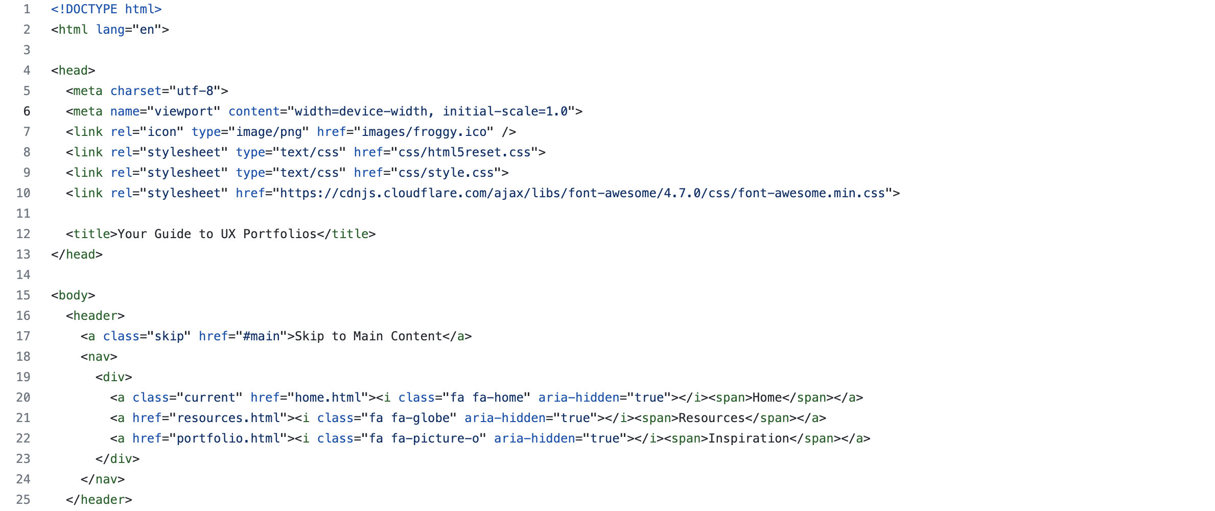
The full code that I developed for this project can be viewed on my Github. Additionally, you can view the final deployed website.


The launched site
Final Thoughts
During the development of this website, I realized the extent importance of thorough and well-designed wireframes. If I hadn’t created any grids or columns in my wireframes, development would have been significantly more difficult. Creating wireframes also helped me to achieve each of the requirements of the rubric.
From this project, I’ve developed a more cohesive understanding of what goes into web development, and how designers can make it easier for developers. Since the completion of this website, I’ve developed my understanding of grid systems in Figma which has improved the transferability of my designs. It is also what I’ve applied to later projects, such as MediHealth, which is discussed in the next section.


